This is our final video 'The Secrets of Mr Myles'.
Monday 29 April 2013
Saturday 27 April 2013
Looking back at your preliminary task (the continuity editing task), what do you feel you have learnt in the progression from it to full product?
Me and Mikalah filmed our preliminary at the start of the year, so we both had very little knowledge when it came to filming. Looking back at the preliminary task, I feel I have learnt a lot in terms of editing, camera and titles.
 In the preliminary task, we had to use the 180 degree rule and use shot reverse shot whilst 2 people was having a conversation. We did not use both of these techinques in our opening since their was no dialogue used. In our preliminary, we only used common shots such as close up and long shot. We also didn't use any camera movement, which could make the video boring.
 In our opening, we used a range of several shots such as extreme close up and long shot; by using these different camera shots and movement, we learnt the importance of them and what effect it can have. We also used camera movement which made video more interesting than our preliminary.

In our preliminary task, we was required to include match on action. Also I understood what match on action was, I didn't understand the purpose or importance of it.
In our opening, we did not include match on action. Although we didn't include, we could of included it was our main character was walking out the gate, we could have vied in on her closing the door behind her. Depsite not adding this camera techinuq in, I now understand that this techique makes the audience focus on the action more, and what effect it can have on the audience.

During the process of making our media product, I have learnt about making titles, and how the font and colour of the titles can reflect the genre of the film. In the preliminary task, I didn't even include titles simply because I didn't know how to sincePremiere Pro was new to me at the start of this course.
I now undertand how to include titles; I also know how the credits within a film opening can have an effect on the audience.
In my preliminary, I only used 1 editing technique which was straight cut. Although this editing technique was useful, I didn't have a range of different editing techniques which made the preliminary quite boring. In our film a few different editing techniques including straight cut and wipe.Whilst editing our film, I learnt how to add different editing techniques, where to appropriately place them and the importance of it. The pace of the scenes was more fluid than the prelimniary, which makes the opening more eaiser to watch.
 In the preliminary task, we had to use the 180 degree rule and use shot reverse shot whilst 2 people was having a conversation. We did not use both of these techinques in our opening since their was no dialogue used. In our preliminary, we only used common shots such as close up and long shot. We also didn't use any camera movement, which could make the video boring.
  In our opening, we used a range of several shots such as extreme close up and long shot; by using these different camera shots and movement, we learnt the importance of them and what effect it can have. We also used camera movement which made video more interesting than our preliminary.
In our preliminary task, we was required to include match on action. Also I understood what match on action was, I didn't understand the purpose or importance of it.

In our opening, we did not include match on action. Although we didn't include, we could of included it was our main character was walking out the gate, we could have vied in on her closing the door behind her. Depsite not adding this camera techinuq in, I now understand that this techique makes the audience focus on the action more, and what effect it can have on the audience.

During the process of making our media product, I have learnt about making titles, and how the font and colour of the titles can reflect the genre of the film. In the preliminary task, I didn't even include titles simply because I didn't know how to sincePremiere Pro was new to me at the start of this course.
I now undertand how to include titles; I also know how the credits within a film opening can have an effect on the audience.
Friday 26 April 2013
What have you learnt about technologies from the process of constructing this product?
The equipment we used was:
A camera: with this equipment, we learned to take different shots linking to the genre
Computer: we learned
to operate different software’s such as Adobe Premiere Pro and Prezi.
The main equipment we used was a camera. Both of us
has very little knowledge of taking media shots and angles, so this was very new
to us. Through this piece of equipment, we learned to take different media shots and angles, the purpose of media shots/angles and the effect it can have.
We didn't use a tripod whilst filming because we didn't feel it was needed.
When we took the shots, we went to ICT department so the footage could be accessed on the school. When we did this, we was ready to edit.
 During the editing process on making the opening
credits to our film, we used ‘Adobe
Premiere Pro CS4’. From using this software, I learnt how to crop footage,
add different editing effects such as wipe and dissolve and add titles within
the film. The software was difficult to understand at first, but the more we used it, the more we understood how the software works.
During the editing process on making the opening
credits to our film, we used ‘Adobe
Premiere Pro CS4’. From using this software, I learnt how to crop footage,
add different editing effects such as wipe and dissolve and add titles within
the film. The software was difficult to understand at first, but the more we used it, the more we understood how the software works.  During this media course, we also learnt how to use Prezi, which is a software which allows you to create presentations in a slightly different way. We used Prezi to discuss the role of the BBFC and the purpose of them. From using Prezi, I have learnt how to create presentations using a range of pictures, save it and upload it to blogger.
The camera we used was mikalah's camera, which was Panasonic SDR-S70. We both had very little knowledge when it come to filming shot and camera movemet. From this piece of equipment, we learnt how to take severeal camera shots and movements.
Thursday 25 April 2013
How did you attract your target audience?
 For our film opening, we used questionnaires, which we handed out to
students between the ages of 16-18 to find our information about the audience
we was targeting and what type of film they would be interested in.
For our film opening, we used questionnaires, which we handed out to
students between the ages of 16-18 to find our information about the audience
we was targeting and what type of film they would be interested in. From the information we collected, we then used the information to put into a pie chart and analyzed the data we collected. From the analysis of the data, we then based on decision.

We also created a Twitter page to attract our audience. Twitter is common for ages we are targeting, so we thought it was a good idea to use that particular social website to attract our audience. Through this social website, we could also keep audience informed about the film's updates.
To attract our audience, we also showed our video to 2 students and our media to receive feedback on how we could improve. The video was showed was our previous opening for our previous video. The feedback we received was the film opening didn’t particularly have a hook, which made it less interesting and due to that feedback, we decided to change the idea to the current one we have now.
Wednesday 24 April 2013
Who would be the media audience for your product?
The age range for our film opening is 16-24 year olds. This
age group usually watches show on E4, the reason why think Film4 would distribute
our film.

The target audience for our film would be generally be quite young, between the ages of 16-24. The genre of our film opening is crime/thriller and because the thriller genre is quite popular within the age group, supported by the research we did earlier in the course. Our film would most likely appeal more the male gender rather than female as crime usually attracts the male genre more, which is also supported by the results of our questionnaire. Our film isn’t for a specific ‘group’ of people based on their ethnicity, sexuality, race or religion. From indentifying who our target audience is, if we had the finance, we could advertise on channels such as E4 since this channel is very common for our target audience. We could also advertise in cinema during blockbusters which advertise the same targte audience as us.
What kind of media institution might distribute your media product and why?
Our company logo is ‘Fast Forward Productions’. A production
company is a company who creates the film. Some of the responsibilities a production company does are: finding a
director, actor, managing budgeting and managing scheduling


To make a film, the media institutions would need money in order to make the films such as ours. To receive that money, they may receive sponsors or investors which hopes to make a profits. Some media institutions may even fund raise for their film. If a film becomes very successful in the public after distributing, media institutions may receive more sponsors who may pay for more advertising which would cause the film to have more success. For example, The Inbetweeners Movie is a low budget film and only started adverting on channel 4. After the trailers was successful with the audience, they started to receives sponsors and they managed to advertise to even more channels like ITV which increased the film’s success.

A distributor is an agency/company that send the film
outside for the public to see. A distributor are responsible for the marketing
of the film; they decide where they are going to advertise and some decide the
release date of the film. If we was
going to distribute our film to the public, the programmes we would advertise
on shows like ‘The Inbetweeners’ because that shows is very popular within the
16-24 ages group. It’s common for people within that age group to not watch TV
in ‘real time’ anymore because they often too busy so we would advertise on
catch up services as this could reach to our target audience more rather than
real time advertising.


To make a film, the media institutions would need money in order to make the films such as ours. To receive that money, they may receive sponsors or investors which hopes to make a profits. Some media institutions may even fund raise for their film. If a film becomes very successful in the public after distributing, media institutions may receive more sponsors who may pay for more advertising which would cause the film to have more success. For example, The Inbetweeners Movie is a low budget film and only started adverting on channel 4. After the trailers was successful with the audience, they started to receives sponsors and they managed to advertise to even more channels like ITV which increased the film’s success.

The media intuitions which might distribute our film is Film
4.Film 4 is owned by Channel Television Operation and they have been
responsible by supporting several films made in the UK. Film 4 has frequently
created ‘them nights’ for their movies in terms of actors, genre, director or
occasions (Christmas, Halloween, Valentine’s Day etc. Our movie fits into
crime/thriller genre so this film may be shown on Film4 around Halloween time.
The reason for this specific media intuitions is that
Channel 4 have their own channel called ‘E4’ which targets audiences between
16-24, the same age group as film. We think that this media intuition will be
the perfect choice for our film because our film would be advertised on E4,
meaning that our trailers and other advertisements are reaching the intended audience. Some of the
films that Film4 own or support include:
·
The Inbetweeners
·
The Lovely Bones
·
Attack The Block
·
Shaun Of The Dead
·
Seven Psychopaths
The content of film openings are the titles. The purpose of
titles is to make the audience aware who is in the film, and who is responsible
for the film they are about to see. The main titles which are usually shown in
an opening include:
·
Director
·
Main Actors
·
Editor
·
Film Titles
·
Camera
·
Studios
The studio is usually first shown in the sequence to allow
the audience to know who is responsible for the distribution of the film. The productions of the film can be shown at the start or end of a film opening,
although it is usually more common to be shown at the end of the credits. The
main actors are usually shown first before all the camera and editing work;
this gets the audiences attention and make the want to carry on watching if an
actor they like is starring in the film. Camera is usually then shown followed
by editing. The director is shown at the end of the screen to give the name a
bigger impact, and it tells the audience who is responsible for the film they are
about to see.
We have taken the order of titles into consideration for our
film opening. The first credit we have used is the production company, which is
then followed by the two actors in our film opening. The actors are then
followed by camera work, which is followed by editing work. The second last titles
in the main title of the film; which the background goes to black to put more
focus on the title so the audience remembers it. The last credit we have in the
director, again showing the audience who is responsible for the film they are
about to see.
How does your media product present particular social groups?
 The main character in our opening is Aimee. She is dressed in jeans, a t shirt and a jacket which shows she is going out. The only thing she is carrying is her bag.
 The main character is kidnapped by our second character.
We have compared the main character to the character in 'Saw'.
 The character is Saw is kidnapped by another character called 'Jigsaw'. The character is dressed in a jeans and a white t shirt, similar to our character but his clothes looks very scuffed unlike our character which the clothes isn't torn or dirty. The differences within these character is that they are a different gender.
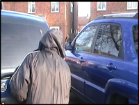
Our second character is the attacker. This character is dressed in a dressed in dark clothing and they have their jacket hood up to keep their face hidden from the other character.
The attacker is compared to the character in 'Taken'
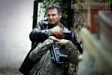 The character is taken is also wearing a black jacket. Unlike the second character in our opening, this character doesn't keep their face hidden, which could mean they want their victim to know who they are. These two character have similar actions as they both take their victim with their hand; they don't use any weapons.
 In what ways does your media product use, develop or challenge forms and conventions of real media products?
I have picked 9 frames to show how our media product used, develop and challenge forms and conventions of real media.
Frame 1
 |
Frame 2

The second frame shows the production company; the font
colour used was red to indicate the genre. The lightning is high key and the
character’s identity is still remained unknown, which would create suspense.
Frame 3
 The next frame is still set in the characters house, just
in a different room. This shot is the first time the audience can view the
main character properly. The character
is dressed a t shirt to show they are a normal person yet the t shirt is dark
so it doesn't contrast to the genre where characters are usually dressed in
dark colours. The credit in this title shows the person who is playing this
character. We have detected a continuity error with this area as the outside
window is dark, yet the rest of our opening in light and we didn't have enough
time to re film this part.
The next frame is still set in the characters house, just
in a different room. This shot is the first time the audience can view the
main character properly. The character
is dressed a t shirt to show they are a normal person yet the t shirt is dark
so it doesn't contrast to the genre where characters are usually dressed in
dark colours. The credit in this title shows the person who is playing this
character. We have detected a continuity error with this area as the outside
window is dark, yet the rest of our opening in light and we didn't have enough
time to re film this part.
Frame 4
 The next frame shows the main character brushing her teeth,
showing that she’s ready to go out soon. The shot used in a close up of the
sink and toothbrush to show that she’s in the bathroom. The credit shows
another name, which shows there is another character in this sequence which hasn't been shown. . The shot used is a straight cut, just to keep the scene
realistic and it seemed most appropriate. This frame contains high key lighting, to keep the idea of the scene being realistic.
The next frame shows the main character brushing her teeth,
showing that she’s ready to go out soon. The shot used in a close up of the
sink and toothbrush to show that she’s in the bathroom. The credit shows
another name, which shows there is another character in this sequence which hasn't been shown. . The shot used is a straight cut, just to keep the scene
realistic and it seemed most appropriate. This frame contains high key lighting, to keep the idea of the scene being realistic.Frame 5

This frame shows the
main character walking downstairs whilst grabbing her coat and bag, showing
that she is leaving the house. The character is still in the house, but just a
different room. The lighting is still high key, yet is lightening is very dark
which links to the genre.The credits shown in this frame are 'edited by'.
Frame 6

The next frame introduces to a different character and a
different setting. The new character is shown to be outside. The second
character is holding document, whilst wearing black gloves. The reason we used
this clothing was to show the audience that the second character is a criminal.
The second character identity is not revealed, which is done to create suspense
and question of who this second character is.
The shot used is a close up on the documents.
Frame 7
 The next frame shows the second character walking round the
car, trying not to be spotted. The lightening is very bright, which contrasts to our genre since the lightening is usually dark. Due to changing our idea a few times, we found it difficult to film when it was more darker. The second character is wearing a black jacket
with their hood up. The dark clothing of the second character suggests the
opening is a thriller/crime since it’s very common within the genre.
The next frame shows the second character walking round the
car, trying not to be spotted. The lightening is very bright, which contrasts to our genre since the lightening is usually dark. Due to changing our idea a few times, we found it difficult to film when it was more darker. The second character is wearing a black jacket
with their hood up. The dark clothing of the second character suggests the
opening is a thriller/crime since it’s very common within the genre.
Frame 8
 This frames shows the title of the film. The colour on the font at the start was white, which quickly flashed to red, which suggests the opening is a thriller/crime since the colour is associated with blood, alert and danger. The font is 'chiller' which gives it a slightly edgy effects. The reason we chose this font is that it was similar to other thriller/crime films.
Frame 9

The last frame shows the directors. We placed this credit at the end since it's commonly used, possible because it gives the credit a more powerful effect. The credit is placed slight off centre or 'rule of thirds' just so the screen didn't look uninteresting.
Monday 15 April 2013
The Ward 9 Titles
9 Titles
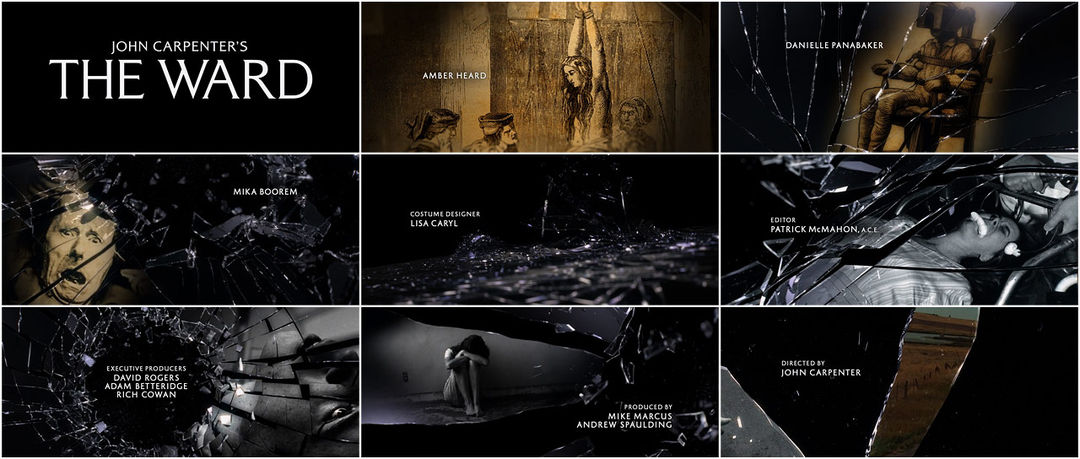 Trailer
The font is all in capitals and in the colour white which gives a 'ghostly' effect, linking with the genre. The font tends to fade in and out, which adds to the 'ghost' element.
The title at the beginning flicker very lights shades of blue at the sound of lightning, which is where the background music starts. This gives the opening sequence an edge and creates suspense for the audience.
The title at the beginning flicker very lights shades of blue at the sound of lightning, which is where the background music starts. This gives the opening sequence an edge and creates suspense for the audience.
Subscribe to:
Posts (Atom)